ShopDreamUp AI ArtDreamUp
Deviation Actions


Description
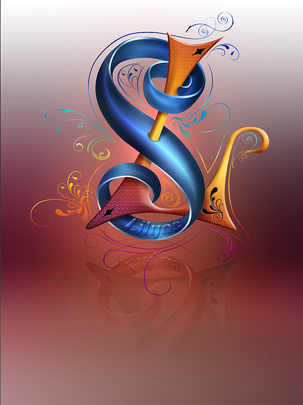
I am working on a new web design for myself and thought about a suitable logo to start with. I know this design is more an artwork than a logo but I think it can be easily reduced to very few colors and simplier shapes. I am not sure if I will incorporate this one but so far I like it. These are my initials L.S. for Lily Seidel.
PLEASE, if you have some helpful thoughts about this design advise me of them! What do you like in it, what would you change? Any critical feedback is welcome!
EDIT: Wow, thanks for the numerous comments so far! There are many interesting aspects for improvement. But I have to mention (since many people criticized it) that the "Lilyas" writing is more meant as a signature/watermark and doesn't really belong to the artwork!
This is a vectorbased design completely done in Photoshop CS3.
 My Design Collection
© Copyright by Lily A. Seidel 2009. All rights reserved. You may not use my work without my written permission.
PLEASE, if you have some helpful thoughts about this design advise me of them! What do you like in it, what would you change? Any critical feedback is welcome!
EDIT: Wow, thanks for the numerous comments so far! There are many interesting aspects for improvement. But I have to mention (since many people criticized it) that the "Lilyas" writing is more meant as a signature/watermark and doesn't really belong to the artwork!
This is a vectorbased design completely done in Photoshop CS3.
© Copyright by Lily A. Seidel 2009. All rights reserved. You may not use my work without my written permission.
Image size
600x800px 156.19 KB
© 2009 - 2024 Lilyas
Comments183
Join the community to add your comment. Already a deviant? Log In
What about incorporating a Lily (flower) into the Lilyas logo...
Or maybe adding all of the letters so that you have a true Lilyas logo...
I like your choice of colors and the mirror reflection in the bottom part of the image...
But there does appear to be to much of a void in the bottom of the image (it would be good to even out the top and the bottom)...
I know that you have Lilyas in the image but maybe making Lilyas totally visible in the image would be a good thing...
Overall it is a good image but it could do with some improvement...
I will be interested in seeing what you come up with in the future <img src="e.deviantart.net/emoticons/s/s…" width="15" height="15" alt="